BACK TO Media
August 7, 2026
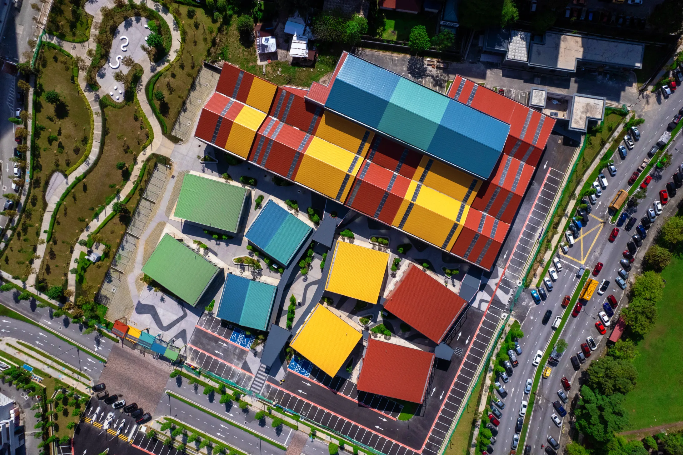
Colour possesses a unique power in architecture. It can guide, uplift, and transform our perception of space.
Design firm SPARK Architects masterfully wields colour not merely as decoration but as a strategic tool to regenerate urban environments, foster community connection. This intentional approach mirrors the philosophy behind Nippon Paint’s Trend Beyond Colours forecast: that colour selection should never be arbitrary, but rooted in deep cultural research to ensure it resonates with the human experience
Through the insights of Lim Wenhui, a SPARK architect based in Singapore, we explore how deliberate colour strategies breathe new life into diverse projects, demonstrating that thoughtful design can create value and inspire purpose.
Regenerative Red: Wayfinding and Identity in Minhang Waterfront
Urban regeneration requires bold vision. One ambitious project in Shanghai, focused on seamlessly blending two distinct environments, injected vitality into a revitalised riverfront area. Drawing inspiration from the natural environment, such as waves and river organisms, the firm utilised a vibrant hue known as "regenerative red"
This vibrant hue manifests as a continuous path and bridge, acting as a powerful wayfinding tool that physically and visually links the entire master plan, drawing people towards the revitalised area. More than just a pathway, the red elements transform into dynamic 3D urban sculptures, creating landmarks that signify the area's renewal from afar. This demonstrates how strategic colour choice can provide clarity, identity, and narrative within a large-scale urban landscape.
Graphic Interventions: Revitalising Public Spaces in Singapore
Sometimes, the past informs the future. In Singapore, a project involved retrofitting an existing building, previously a gaming centre, into a vibrant community hub and campus extension for students. SPARK embraced the building's history, using bright, graphic colours reminiscent of gaming aesthetics.
This playful yet strategic use of colour and graphics serves a dual purpose: it gives the space a fresh, energetic identity that appeals to students while subtly acknowledging its roots within the community. This adaptive reuse project showcases how colour can bridge history and modernity, revitalising a public space and giving it a renewed sense of purpose and a "new lease of life".
Community Imagination: Designing with Children in Bangkok
Truly impactful design often stems from deep community engagement. In Bangkok, a centre designed to teach life skills to children from disadvantaged backgrounds stands as a testament to participatory design. SPARK Architects embarked on a unique co-creation process, inviting the children to draw their dream school.
The result is a building brimming with imagination. Bold colours distinguish the purpose of each of the five levels, with a sunny, "youthful yellow" taking centre stage. This vibrant yellow defines the central staircase and is a whimsical yet functional wayfinding tool connecting all floors. This bold approach mirrors the "Between Worlds" theme from Nippon Paint's Trend Beyond Colours 2026-27 forecast, which champions the use of high-energy, immersive hues to create dynamic spaces that captivate and connect. It directly translates the children's desire for colour and the architects' commitment to listening. This project powerfully illustrates how involving end-users, especially children, can create joyful, meaningful, and deeply resonant spaces.
Key Insights for Aspiring Designers
Lim Wenhui emphasises that impactful design shouldn't rely on formulas, particularly colour. Her advice for emerging designers resonates with the ethos seen in the AYDA Awards content:
This is where tools like Trend Beyond Colours become invaluable. By consulting such forecasts, designers can understand the sociological and emotional drivers behind emerging palettes. This allows you to back your creative intuition with research, ensuring your colour choices aren't just trendy, but are contextually relevant and psychologically tuned to your audience. By understanding the context, listening to the community, and daring to use colour boldly yet purposefully, architects and designers can create spaces that capture the eye, genuinely connect with people and revitalise our built environment.
Showcase your design to an international audience
SUBMIT NOW
Image: Agrapolis Urban Permaculture Farm by David Johanes Palar
Top

The AYDA Awards is part of Nippon Paint’s vision to nurture the next generation of Architectural and Interior Design talents. It serves as a platform to inspire students of these disciplines to develop their skills through cross-learning.